Small Text and Elements: Artwork Requirements
Small Text and Elements: Artwork Requirements
Tips for Avoiding Blurry Prints with Small Text and Elements
When it comes to Small Text and Elements in artwork, there are certain requirements and considerations that you need to keep in mind to ensure clarity and legibility. Whether you're designing a logo, poster, or any visual composition, here are some important guidelines for handling small text and elements effectively:
1. Font Selection: Choose a font that is easily readable even at smaller sizes. Avoid intricate or script fonts that may become blurry or illegible when reduced in size. Sans-serif fonts like Arial, Helvetica, or Roboto are often preferred for their clean and clear appearance.

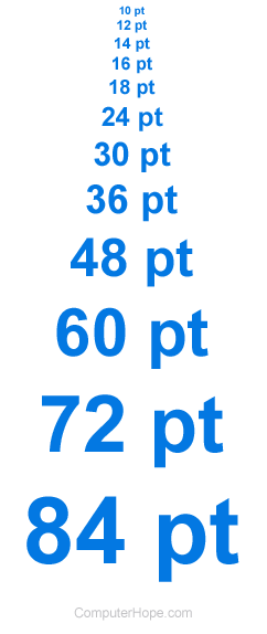
2. Font Size: Select an appropriate font size that ensures readability when printed. As a general guideline, use a minimum font size of 8-10 points for body text. However, the ideal size may vary depending on the font style and design. Test the print quality and readability at different sizes to find the optimal balance
3. Contrast: Create a noticeable contrast between the small text/element and its background to improve visibility. Use contrasting colors or adjust the opacity to enhance readability. For example, light text on a dark background or vice versa can provide better legibility.

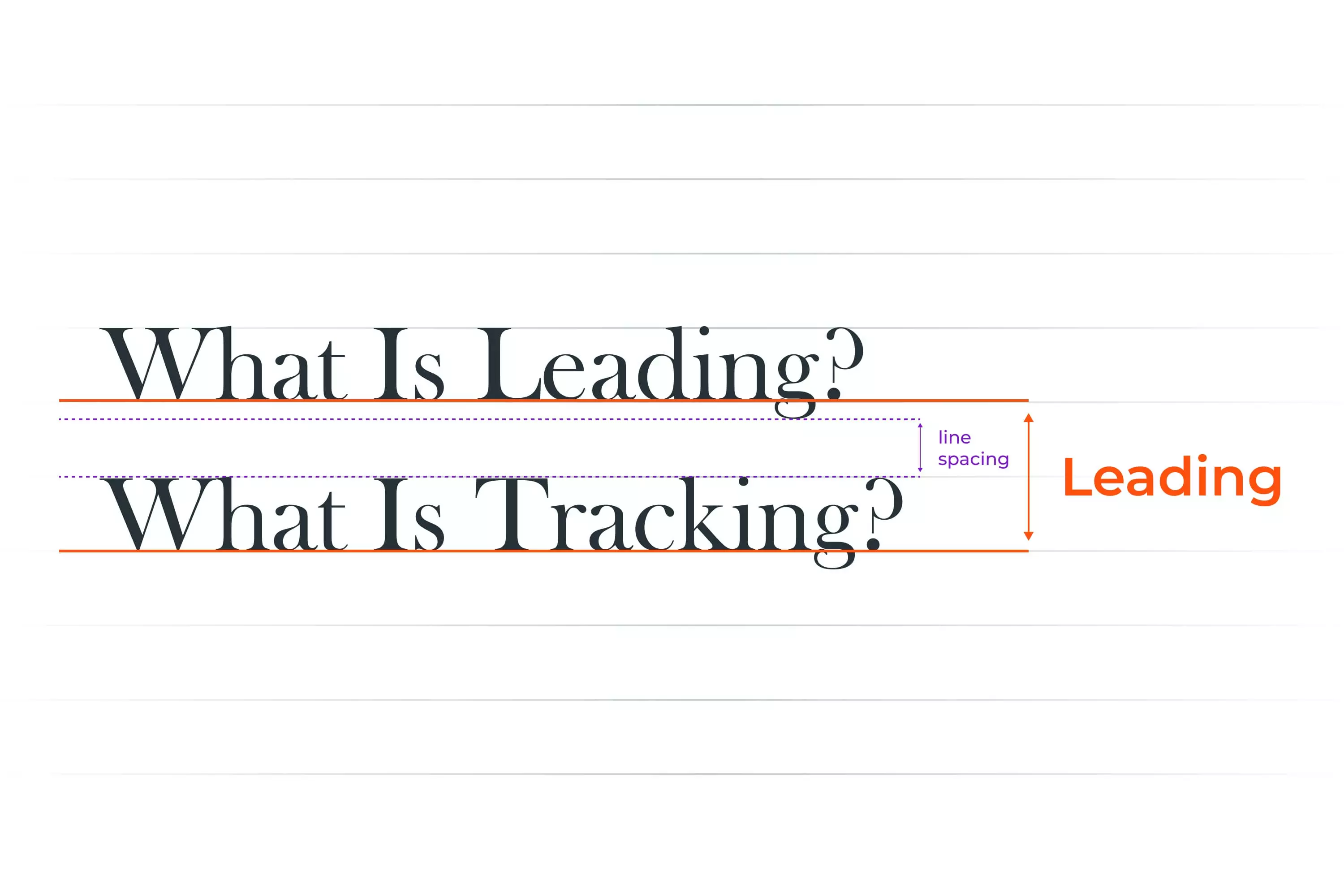
4. Kerning and Tracking: Pay attention to the spacing between individual characters (kerning) and overall letter-spacing (tracking). Adjusting these parameters can make small text more readable by preventing characters from blending together or appearing too cramped.
![]()
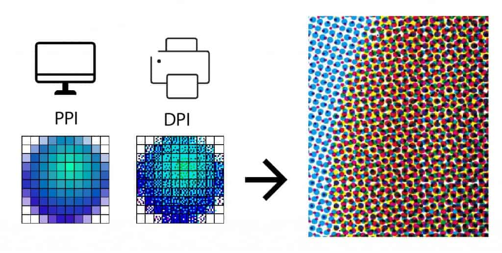
5. Print Resolution: Ensure that your print files have a high resolution to maintain the sharpness and clarity of small text and elements. Use a resolution of at least 300 dots per inch (DPI) to ensure crisp printing quality.
Remember, the goal is to make small text and elements readable and visually appealing. By considering these guidelines and conducting thorough testing, you can create artwork that maintains its impact, regardless of its size.
Other Considerations
In addition to the factors mentioned above, there are a few other considerations that should be taken into account when printing small text and elements. These include:
- The type of font. Some fonts are more readable than others in small sizes.
- The overall design of the artwork. The placement of the text and the other elements in the artwork can affect its readability.
- The intended audience. The readability requirements for small text will vary depending on the intended audience. For example, small text that will be read by children will need to be larger than small text that will be read by adults.
Conclusion
By following the guidelines outlined in this article, you can help to ensure that small text and elements are readable in print. By paying attention to the font size, line spacing, contrast, resolution, and other factors, you can create artwork that is easy to read and understand.
Here are some additional tips for ensuring small text and elements are readable in print:
- Use a sans serif font for small text. Sans serif fonts have simple, clean lines that are easier to read in small sizes.
- Avoid using italics or other decorative fonts for small text. These fonts can make the text difficult to read.
- Use a light color for the background behind the text. This will help the text to stand out and be more readable.
- Test the print before you finalize the artwork. Print a test copy of the artwork and check the readability of the small text.
By following these tips, you can help to ensure that your small text and elements are readable in print.